Portfolio Works*
Portfolio Works*
Portfolio Works*
Portfolio Works*
Portfolio Works*
Portfolio Works*
It is impossible to show everything so I show my favourites and the most challenging ones.
*Before checking my portfolio don't forget to read full CV on the profile page or download it as a shorter PDF
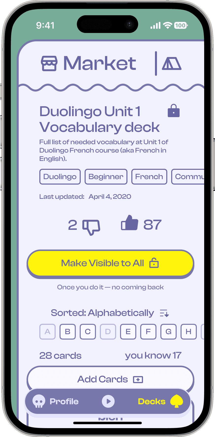
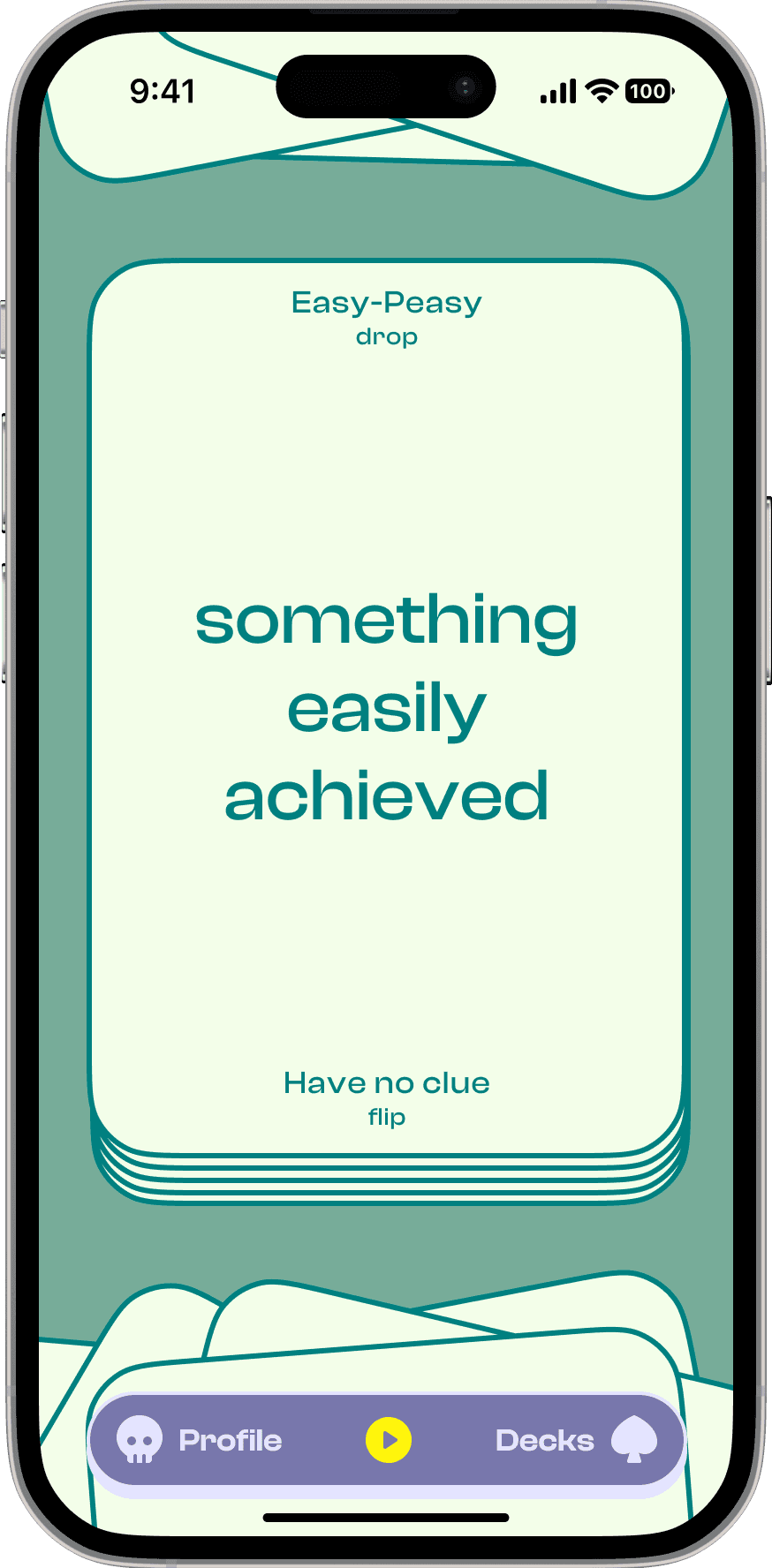
Askeza
Building tech startup that simplifies vocabulary learning
Our mission is to make vocabulary obtaining simple but effective. Service houses a sophisticated model that optimises learning through flashcards with maximum effectiveness. On the top of this — tons of preinstalled decks for Spanish, French. and German.
Like it always in startups my role is to do basically everything except coding, but the most improtant are conducting comprehensive research, designing interface, and establishing a methodology.


Interface
Design Strategy and Team Leading
I love projects with the B2B model — so different, so unexpected. Totally opposite to B2C which could be done with closed eyes. Same with Interface — carpeting provider leader — unique, intricate, and huge at the same time.
My role was to lead the project — design strategy, documentation creating, team managing, prototyping of the most important packages, work reviews, presentation to the internal team for feasibility checks, holding of all cross-department communications, running demos, all communication with the client, and finally reviewing artefacts of other departments.
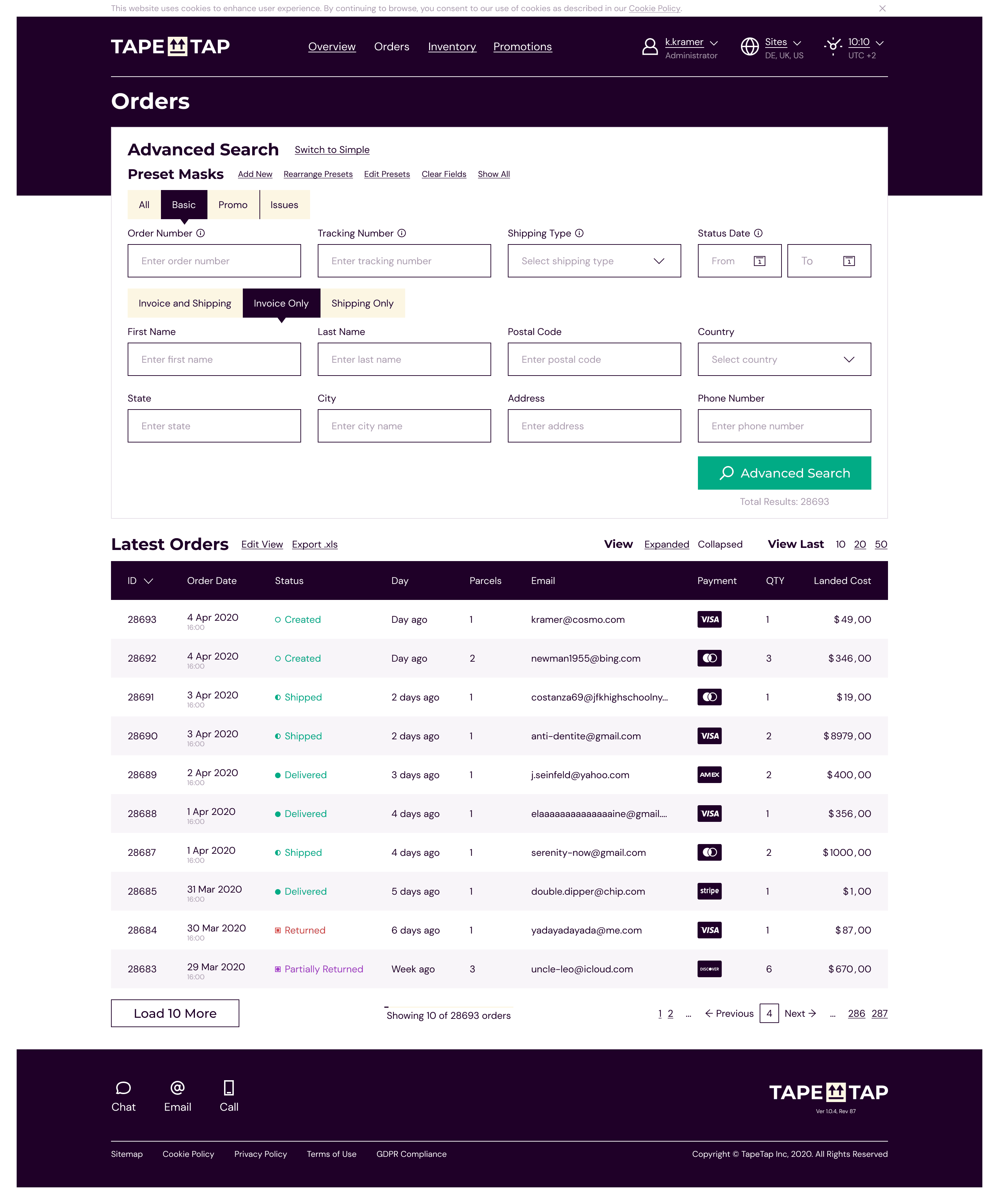


TapeTap
Order Management System discovery and very first phase
OMS's are complex solutions and doing them fast without research is risky. Nevertheless, I hopped in right after the dev team created a prototype with 40+ input fields on the main page and ready for implementation.
My work was in delivering fast result to unblock team and start gaining users with first feedbacks. I created design strategy, concept, placed the foundation for fast paced iterations and scalable approach for future phases.
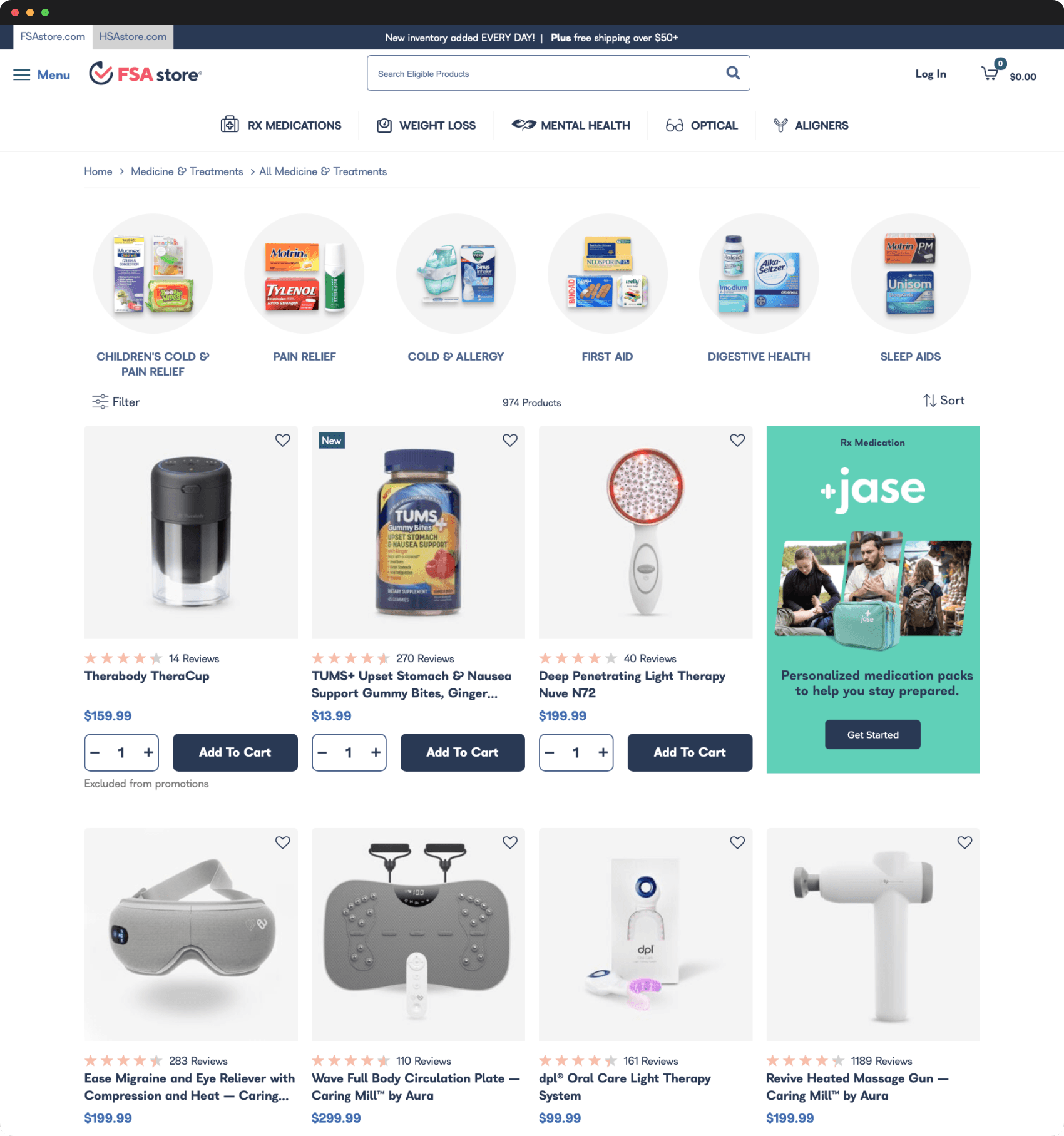
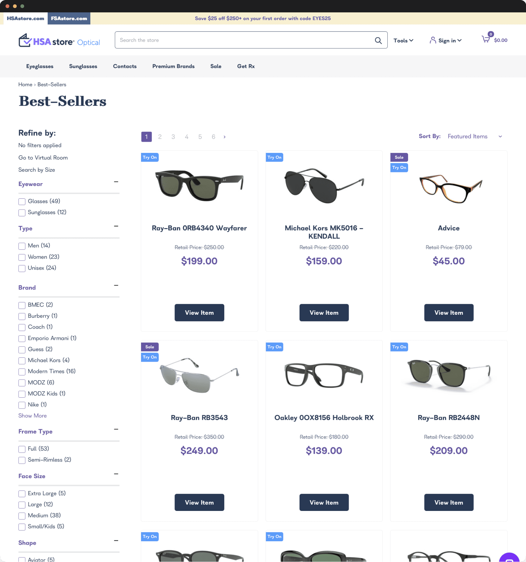
FSA, HSA, and WellDeserved stores
Redesign of webistes under the umbrella of Health E-commerce
From virtual mental health to prescription weight management support to prescription acne care and personalized allergy treatments, Health-E Commerce (HEC) is dedicated to simplifying the shopping experience for all FSA and HSA program users by selling only program-eligible products.
I led the redesigning user experience of 3 HEC brands on the SFCC Reference Application in an alike style while maintaining each brand’s unique identity. Besides the scope of work, and despite the well-known B2C model project challenged us with the taxes specialised functionality.


Orsay
Redesign of the multi-locale SFRA store
Orsay is a German apparel brand offering trendy fashion for women, and has over 400 shops across Europe. The brand is committed to providing fashion-forward designs, a wide selection, and uncompromising quality, all at an affordable price. Orsay's mission is to empower every woman to express her unique style and personality with clothing for all occasions.
I successfully led the UX design team through the redesign of the e-commerce store by bringing to life the complex concepts of an art director in the graphic design study field — handled client expectations by finding feasible solutions together with developers.
AllSaints
Project Discovery and Time Effort Estimation
Despite e-commerce is well-known business model, AllSaints is an entry-level luxury fashion brand and needed special treatment. I've made analysis, studied Google Analytics data, prepared slides with suggestions, and ran workshops. After creating of Solution Requirements Documentation I estimated both functional and non-functional parts of UX team work .
On the preview you can see some of my presentation slides in the style of the client — posh and monochrome, but still with my touch — clear and dynamic.
READY
TO TALK?
Follow me maybe
Let’s work
This website
is powered
by cookies.
Typesets are Cosi Times, Clash Display, and a bit of Necto Mono. Copyright © Anton Kharytonov 2012—2025. All Rights Reserved.
READY
TO TALK?
Follow me maybe
Let’s work
This website
is powered
by cookies.
Typesets are Cosi Times, Clash Display, and a bit of Necto Mono. Copyright © Anton Kharytonov 2012—2025. All Rights Reserved.
Follow me maybe
Let’s work
This website
is powered
by cookies.
Typesets are Cosi Times, Clash Display, and a bit of Necto Mono. Copyright © Anton Kharytonov 2012—2025. All Rights Reserved.
Follow me maybe
Let’s work
This website
is powered
by cookies.
Typesets are Cosi Times, Clash Display, and a bit of Necto Mono. Copyright © Anton Kharytonov 2012—2025. All Rights Reserved.
READY
TO TALK?
Follow me maybe
Let’s work
This website
is powered
by cookies.
Typesets are Cosi Times, Clash Display, and a bit of Necto Mono. Copyright © Anton Kharytonov 2012—2025. All Rights Reserved.
READY
TO TALK?
Follow me maybe
Let’s work
This website
is powered
by cookies.
Typesets are Cosi Times, Clash Display, and a bit of Necto Mono. Copyright © Anton Kharytonov 2012—2025. All Rights Reserved.


