Background
Company I worked for already had big presence in e-commerce and one of the agencies they acquired had an Order Management System (OMS).
OMS — is a software tool to manage and track customer orders from the placement to delivery. It ensures smooth organisation so customers receive their products on time.
Our work was to shape an existing OMS to company standards and raise attractiveness to be able to upsell OMS together with other e-commerce services. To achieve this, we needed to enhance the user experience for efficient support team operations and establish a foundation for future iterations.
Existed version of an OMS.
Research
After a brief audit, unstructured, and then semi-structured interviews with manager and support segments of users I gathered following observations:
Fast searchability is crucial as clients or logistics companies often await responses while on the line with a client;
Market leaders typically have complex, feature-heavy interfaces, while smaller startups lack essential features. Our goal is to strike a balance between these;
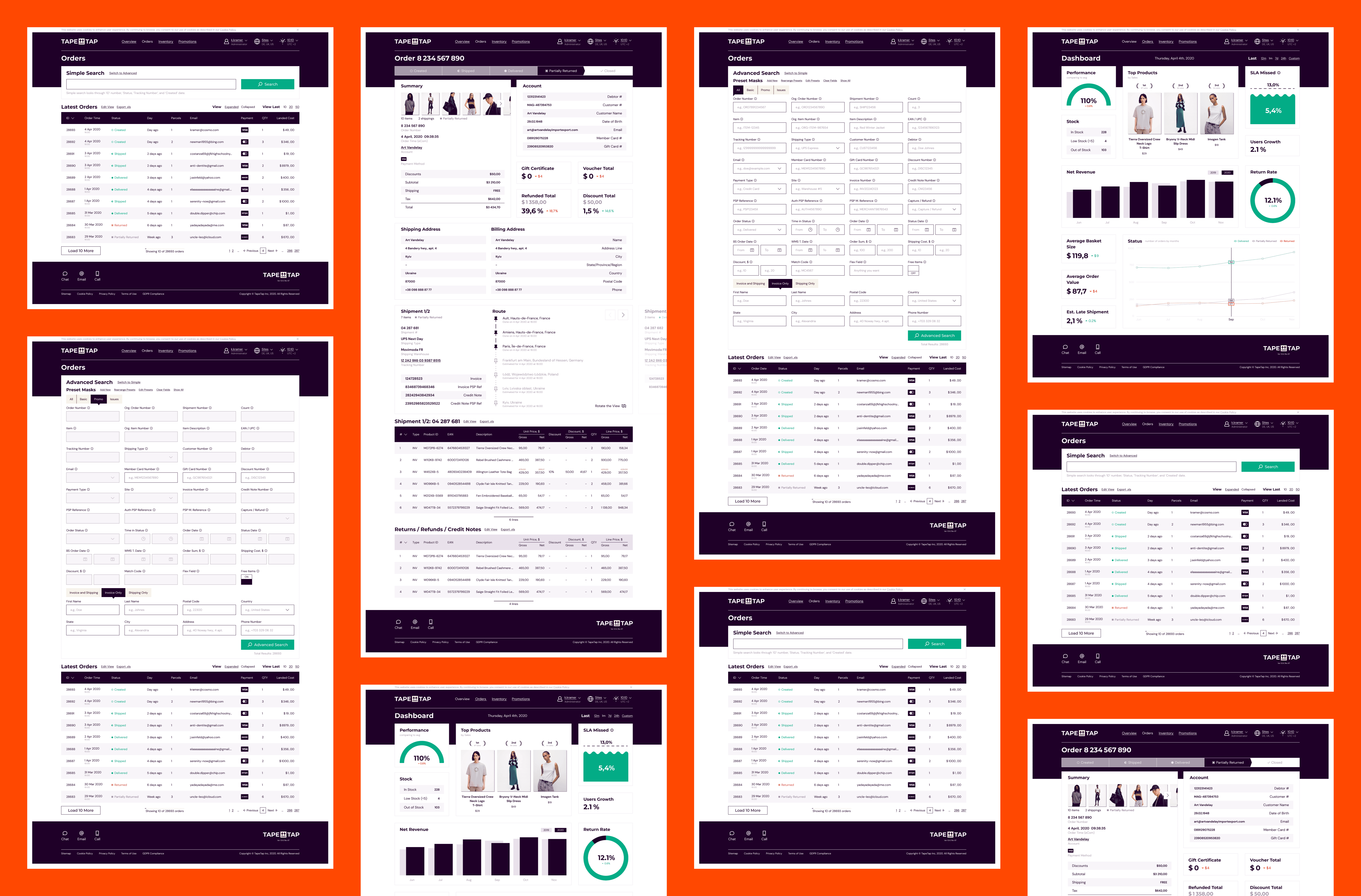
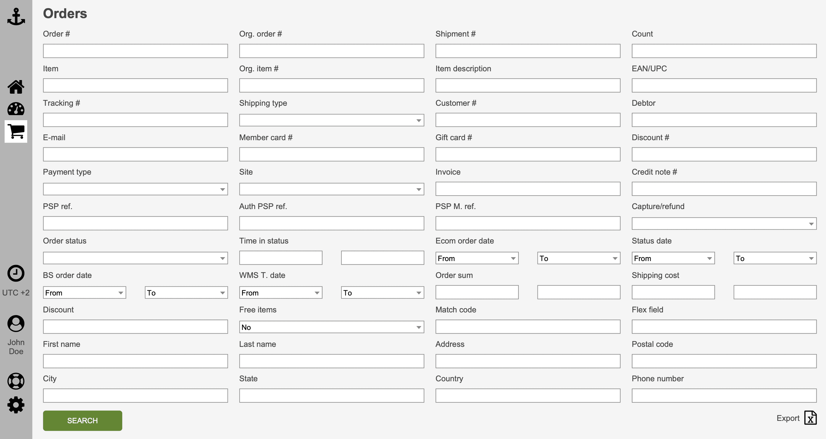
Locating the desired search field among 40 other is challenging, especially when the viewport changes and fields regroup from four columns to three;
It is difficult to find the desired search field, especially if the viewport changes and fields regroup from 4 columns to 3;
There were 4 most frequently-mentioned search attributes (table columns), the others received the same low number of mentions;
The main feature is the orders table, which does not contain all the necessary columns;
Managers have to lean on GA because of the lack of standard e-commerce reports;
Support is overloaded, but no budget soon to relieve them;
No mobile version.
Problems
By summarising insights and observations, we could define several issues (one more will appear later during the process):
Overcomplicated search;
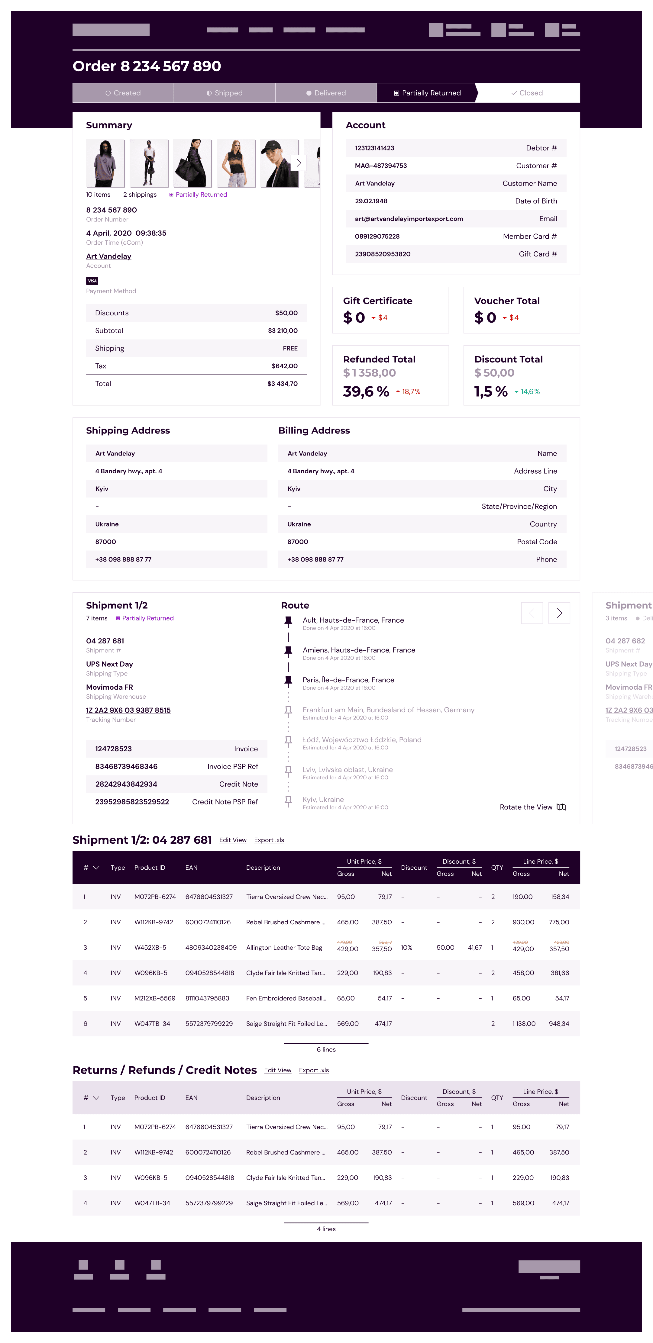
Not enough information fits in the current table;
No actionable insights for a manager.
Solution
First, we created a transparent flow—making the dashboard the start page and laying the foundation for other entities such as orders, inventory, promotions, settings, and user management. These would be presented on the dashboard page shortly after launch to transform it into a fully functional starting point.
For the orders page, we decided to maintain the general approach with 40 inputs to ensure smoother user adoption of the new design. At the same time, we added simplified search functionality and tooltips for every input field to reduce the burden on technical support.
Another goal was to move away from full-width CMS designs and improve readability, which is why we implemented a column-based approach.
Overcomplicated search
The majority of people pointed to search abilities. There were 40 fields, but only four were used in most of cases, so I simplified the standard functionality to one field. Since the ability to search for 40 parameters simultaneously is an overkill even for advanced users, we made a simplified search functionality where we narrowed the search to the four main parameters, leaving the original design as advanced functionality.
We did not stop at simplifying all-in-one search but added mask presets that highlight some inputs and make finding a needed one faster. We also improved the navigation between inputs at desktop viewports by fixing the position of each input in the grid.
Not enough information fits in the table
The second insight was about the desire to squeeze as many columns as possible into the table. Despite the fact that the 3d party we used already allows users to edit the view and add/remove columns, users will not do this all the time. Therefore, at first, we shortened the names of all column headings as much as possible and truncated the text of the results more than we would have liked. It still wasn't enough. One of the respondents joked that they needed N+1 columns, where N was the current number of columns. So, a radical method of expanding the table to the full width of the screen was invented and the idea of a header (the next ‘problem’, or rather lack thereof) was born.
"No" to a side panel
Addressing the issue of narrow tables led us to question the necessity of a horizontal menu bar in this OMS, as it occupies space that could be used for another table column and does not solve any other problem.
Side panels are popular in CMSes because they:
Accommodates many menu items in an organised, scrollable, collapsible way — given our few items, which are irrelevant to us.
Makes better use of horizontal space by preserving vertical space, which is the opposite of our goal.
Supports complex, nested menus which is unnecessary since our menu is simple.
Since our main need is horizontal space, following a typical CMS design doesn’t make sense.
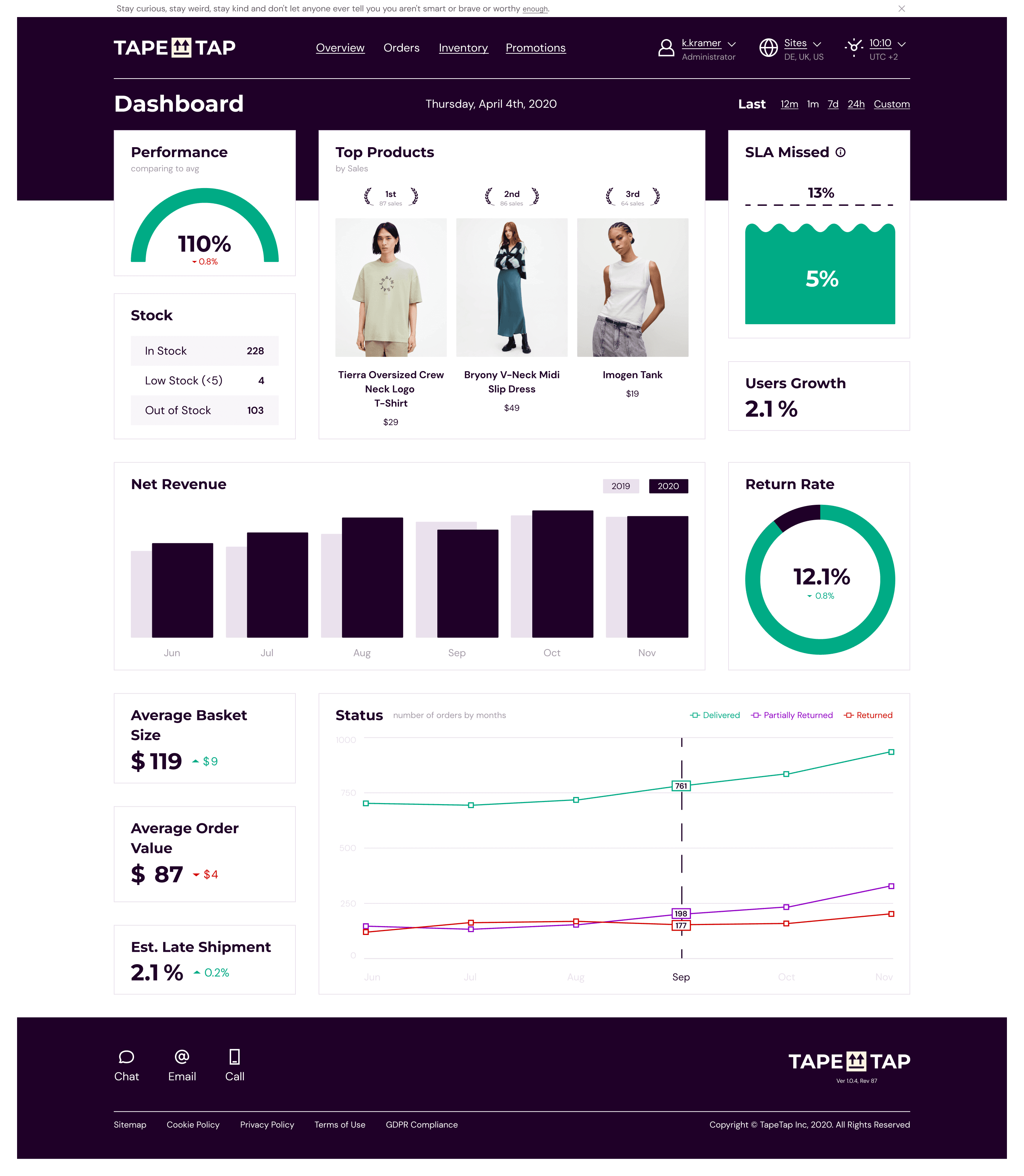
Insights for a Manager
The original OMS didn't have not only a dashboard with basic analytics, but also many, many other things, such as inventory, transactions, customers, and vendors. We prioritised dashboard creating because monitoring is central to what an OMS does and just a natural starting page of any OMS workflow.
Impact
While we made bold choices like implementing 40 search fields and a boxed layout in the OMS, these decisions helped users adapt to the redesign and saved development time. Our user metrics and testing validated this approach - showing increased speed and active usage of the new features. The project has established a strong foundation for TapeTap, and I'm excited to see how the new team will build upon it.
28%
x5
31%
expanding table Feature Usage Rate
2 mins
avg managers spend on the dashboard